Showing posts with label Architecture. Show all posts

Saturday, March 03, 2012

Civic City Cahiers


 recently I've been going through the  great Civic City Cahier series, 
from the lovely folks at Bedford Press (and fellow ASAPers)

 which deals with how we deal with the world


as architects, designers, artists.

 mostly, with how we can keep producing for a world economy 
 that seems to only want to screw us up


1st from the series was Margit Mayers Cahier #1, Social Movements in the (Post-) Neoliberal City suggests a strategic negation of design as a tool for creating cities based on values other than just profit. Picking up a strand of thinking started with Henri Lefebvres' Right to the City, Mayer seems to suggest cities where conflict is a positive tool. Even though she positions the problems of the city quite well, I think the line of thinking does not take us much farther than the Occupy and Indignados movements.
next on my list was Cahier #5, Eric Swyngedouws' Designing the Post-Political City and the Insurgent Polis focus on the anger that has been recently surfacing in public space.  He talks about returning to public space as an inherently political platform, away from the comme-il-faut capitalism of the endless megabrand franchise globalisation and the hopeless and almost banal explosions of anger: "Resistance as the ultimate horizon of urban movements has become a hysterical act; a subterfuge that masks what is truly at stake - how to make sure that nothing changes." Swyngedouw suggests we reclaim the Polis by moving closer to public space as an arena of dispute and even conflict, concluding with three points: to start by thinking of of a free public urbanity, to allow space for Speech, even if that is utopian speech, and third to go beyond the fantasy of neoliberal marketplace which keeps us in fear of a crisis, to accept that the catastrophe has already happened, that we are already within the collapse of a civilization and we just need to choose sides.
 
Cahier #3 though seems to be taking everything a step further, and I guess the numbering is not sequential, since Cahier #4 has yet to come out. (and sadly Cahier #2 is out of print, I guess I missed it)


Tom HolertsDistributed Agency, Design's Potentiality goes beyond the refusal and resistance of the previous volumes,  towards a place where design has joined the system of post-capitalism and attempts to make changes from within, not against. Holert suggests design is a practice of distributed agency, a social, political, anthropological, aesthetic and even engineering practice, and says that what we need to be designing is not participants into the system, but the system itself. As I was reading this, I kept imagining that it would lead to a designing of how space is distributed, how buildings are sold, how construction companies get control of land, how developers actually profit from public space. If we could re-design this system, we would be redesigning our cities, we would be retaking control of public space. In fact, instead of buildings and spaces we should be busy designing political systems. I was taking these thoughts further and further as I've been for the last 6 months working on such a project, to be posted quite soon in this blog.
Yet Holert goes in another direction, perhaps equally interesting. He suggests the space of collaboration, and of the artisan as practices that can withstand the neoliberal tsunami, he imagines economies of community, new ways of "being together", of re-designing the city, improving inherited designs via micro-alterations that engage with the local, of design facing it's own responsibilities in the current landscape. 
Maybe we can do even more? as Holert quotes somewhere :
"If you're going to be a corporate tool, at least be a good one."

Monday, February 27, 2012

Ode to James Wines (SITE)

James Wines is the best
 because he melted buildings before anybody else
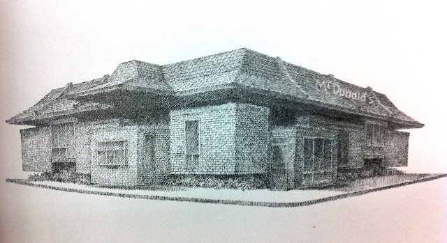
 he is the only architect to have made McDonald's levitate
 he rolled up parking lots like carpets
 just to sweep the building underneath
 
 James Wines allowed houses to be occupied by nature
 made buildings out of hay stacks
 
facades out of anti-gravity rocks
opened up buildings to reveal water


 cracked open shopping malls

 to let the people in

and maybe lock them inside?

that's why James Wines is great

Saturday, January 21, 2012

Postcards from the edge

Browsing through the Graham Foundations' press section yet again, I found this really nice set of photos from Las Vegas Studio: Images from the Archives of Robert Venturi and Denise Scott Brown
of course it is the studio which led 
to the book Learning from Las Vegas, 
which we all know
  I had not seen the entire set of photos, so I decided to study them a bit more.
 (of course this famous image is not from Vegas but from New Jersey) somehow I always understood this book to be talking about a contemporary moment in architecture, instead of Las Vegas in the 60's

Thats because I always confuse car dashboards with computer screens
surfing through a landscape of logos
 surrounded by lit surfaces and animated information
 
 finding corners of peculiarity hidden behind software facades

 google-earthing places I have been to only to notice patterns anew

where reality becomes as abstract as desktop background

 confusing real people for avatars and vice versa
 chatting behing facades of un-updated websites, 
 looking back at the landscape of the screen 
from the desert of the real

Saturday, January 14, 2012

The Collage Career of Stanley Tigerman

(Pensacola Place shopping mall, 1980s)

So I got a nice email from the Graham Foundation about their upcoming Stanley Tigerman tribute. I guess there's been quite a few of those Tigerman tributes recently, though I am always trying to position the work. Post-Modern folly, Avant Garde polemic, early Deconstructivist but also Metabolist, and some curious Architoons (that I almost cant bear to post) and some serious cuteness and some plain weirdness. 
I guess it's a long career but is that too many styles for one person? Or is he the original copy paste tumblerist, the lady gaga of his generation, furiously jumping from reference to quotation, flipping through architectural movements as one really should. 
Eisenmannish grid from the Matrix series
Pre-Sejima minimal cuteness with Daisy House
I mistakenly thought that the facade on the left was the Tigerman one, but in fact it's the one on the right.
The interesting one on the left is Studio Grau, obvs from Strada Novissima Venice

Hans Hollein-ish sinking Mies collage

 Virilioesque and Claude Parent-ish Fonction Oblique from Urban Matrix


upside-down pyramids from the Urban Matrix too, 1960s

  and downright fantastic weirdness 
from his Black Barn renovation


Maybe this drawing explains everything, 
entitled "Career Collage", includes all his work,
though perhaps it should have been called Collage Career instead


(images for this post from the Graham Foundation's press section, from rndrd and Arqueologia del Futuro

Friday, January 06, 2012

Pyramid hunting at Biblioteca Alexandrina


Taking a break from all the teleporting, we skipped over to the Biblioteca Alexandrina, 
which I guess is meant to resemble a papyrus forest (just about the biggest Egyptian cliche). 
Why not go all the way and make it a big Pyramid, why stop at Papyrus?
Well actually the library by Snohetta is super nice, and full of young hipsterish Egyptians, so it was the second positive place after Tahrir that we were visiting. And while we were there, why not have a look at the art and architecture section? I almost felt obliged to look for stuff related to Egypt, maybe some unknown Pyramidometabolist curiosity from the 60s or some shopping mall aberration from the 80s?


of course the first book that catches my eye 
(I never use the search engine on libraries, I always drift in the corridors)
was of course an Isozaki monograph

 Isozaki is of course a major Pyramid lover, starting with his double pyramids from "Cities in the Air"
 to the Pharaonic robots at Osaka expo 1970


 to the super cool Egypt-unrelated projects from the 70s where I guess he was testing early rendering techniques? or maybe these were made later? (and might have this 1973 Country Clubhouse been an inspiration for  Toyo Ito's 1976 U-house?

 a house in Venice Beach, 

 Isozaki was never one to shy away from Cute Architecture

 further down the aisle, Ambasz? relation to Egypt?
 if this fukuoka (or somewhere) city hall is not Pharaonic, I dont know what is
 CCTV before REM? by Emilio Ambasz?
 interesting public building (this is just a detail) that looks eerily like Sou Fujimoto's house NA


further down, Peter Cook
  not sure how to explain the relation to Cook's heaps, mountains and ruins to Egypt but I always liked them so they have to be part of the group. We will worry about conceptual consistency later on, if ever.

  and by the way, here is a half, upside down pyramid by Peter Cook


 Temples and Pyramids ahoy over at Michael Graves, whose work I am always trying to like


great Antony and Cleopatra fabric showroom
 very curious performance space
 Luxor for the people, with ancient billboard sculptures and medieval music playing all over the place
 Legionaire
 Pyramid +
 and my favorite, Cleopatra worthy entrance, Swan Hotel, somewhere in Disneydystopia

 I picked this up not expecting any pyramids, but out of sheer curiosity, because I always want to know more about Charles Moore, 
 the closest thing to a pyramid is Xanadune resort (yes Xanadu and Dune, not Xanax and Dune)
 back entrance to the great Piazza Italia, and I love how out of sync the car are with the architecture. Lets face it, car design just has always sucked.
ok this was the obvious book to pick up, I really tried to find something to like and post, but boredom prevailed and also I could not wait to go through the book next on my stack, 
(and closing time was approaching)

 James Wines and SITE greatness, and even some projects I had never seen in depth,
(and by the way, I just noticed that most of the books were from Rizzoli? did the Biblioteca have a deal? shady? or some donation?)
 maybe we could say that Floating McDonalds is somehow metaphysically EgyptoAlien? StartGate-ish? but in a Kevin Smith way?
 or this Molino Stucky sinking  facade, surely from the Hans Hollein curated Venice Biennial?
 or this absurdly fabulous faux Archaeological office chair showroom entrance? this might as well be the most absurd corporate lobby installation ever
 petrified office chairs and file cabinets sinking in the sand?
 this was unrelated to Egypt obviously, but I had to pick it up
 maybe Persian Gulf is close enough?

a pyramid is always where you least expect it